Module 2 – Chapter 1 – Extra Activity

All this section is an extra activity.  It came about when working the initial stages of Chapter 1.  Before colouring one of the printed font papers, I had ripped the paper into strips and glued them back together again, in a changed order.  From this came the idea of weaving torn strips to produce a different result.  I photocopied some different trial pieces, but the one shown below was the piece I thought had the most scope for development.Module 2 Chapter 1 - Extra Activity

The fonts used, included numbers and symbols.  This makes for a more interesting composition as it comprises hard and soft lines and shapes.  After weaving the paper strips and gluing them to a background, I re-photocopied the page, and this is shown below

Module 2 Chapter 1 Extra Activity (2)

By re-photocopying the patterns made by the act of weaving, become clearer.  From this I isolated sections, cut these sections out and worked on them individually.  These sections are shown below.

Module 2 Chapter 1 Extra Activity (3)

After this I worked on each of the segments, enlarging them over and over until they were of an acceptable size.  Some of the sections were re-cut and then enlarged themselves.  Some examples are shown below.

Module 2 Chapter 1 Extra Activity (4)Module 2 Chapter 1 Extra Activity (5)

Module 2 Chapter 2 Extra Activity (6)Module 2 Chapter 1 Extra Activity (7)

Doing all this took a lot of time out from getting on with the stipulated course work, but I could not resist going down this path.  It has been hugely inspirational and I feel that a lot of personal work will be produced from this activity.  For now I have superimposed these images onto previously coloured backgrounds by tracing off the shapes and colouring them, on the whole, with acrylic inks.  Please see below.

Module 2 Chapter 1 Extra Activity (8)

This background is a mono print made on a Gelli Arts plate and using an alphabet stencil. The enlarged text was painted with acrylic ink.

Module 2 Chapter 1 Extra Activity (9)

A background painted with acrylics, in a random manner, with text painted in black and white acrylic inks.

Module 2 chapter 1 Extra Activity (10)

This image, is using, again, a mono printed background.  The shapes in the background are achieved by using stencils.  the enlarged text was coloured with acrylic ink.

Module 2 Chapter 1 Extra Activity (11)

This image uses a background which was part of a recent abstract painting with an added piece of collage (centre), which I had cropped in readiness for matting and framing.  The text was again coloured with acrylic ink.

I have produced a lot more of these text paintings, but I have shown enough for the idea to be understood.  As I love abstract images, I have found this way of working, hugely inspirational and will carry on with them.  These images could easily be transferred to other media, for example, textiles.  Textiles is another area that I enjoy working in.


Module 2 – Chapter 1 – Fantastic Fonts


Activity 2.1.1 – Find fonts on Your Computer

Module 2 Chapter 1 Activity 1Scan0002 (2)

Tried out some of the available fonts on Microsoft Word.  Did not explore any further than this as I am always a little wary of the free fonts sites.  I am sure that this source will give me plenty of inspiration without looking further.

Activity 2.1.2 – Topsy Turvy Printing

2.1.2 Topsy Turvy PrintingModule 2.1.2 (2)

Module 2 2.1.2 (3)Scan0003

The above pages show examples of topsy turvy printing.  I have tried to contrast the different styles of font.  Some of the font styles include numbers.  This could be useful when this work is developed in the future.

Scan0001 (2)Scan0001

Scan0001 (4)

Just three examples of colouring the papers that had been printed on.  I used different media: mono printing with acrylics on a gelli plate, oil pastels with a wash of watercolour paints, and the last torn strips glued back together again, and a wash of paints added.  This has sparked an idea for an extra activity which I will explore at the end of this chapter.

Activity 2.1.3 – Collecting Words and Letters for Inspiration

Module 2 Chapter 2.1.3Module 2 2.1.3(2)

All these images were collected from magazines and junk mail.  I enjoyed looking for different fonts in their varying sizes, styles and colours.  I am drawn to the black and white hand written examples.

Activity 2.1.3 – Collecting Words and letters for Inspiration

All the following are copies of photographs that were taken by myself on a shopping trip to Knutsford (Cheshire). Lots of inspiration here, so many different fonts on display.  I have enlarged some of my favourite ones.Module 2 2.1.3(3)Module 2 2.1.3(4)

Module 2 2.1.3(5)

Activity 2.1.4 – Make a Collection of Recycled Papers

Below are a couple of photos of part of my collection of recycled papers.  The collection is on going and has grown since these photos were taken.  A sample of the paper collected is: old envelopes, book pages, till receipts, junk mail, newspapers, magazines, paper bags, wrapping paper, tissue paper and paper covered in paint left over from painting sessions.

Module 2 2.1.4 Recycled papers

Module 1 – Chapter 10 – Zigzag Books

Module 1 – Chapter 10 – Activity 10.1 – Celebrating Colour

Years ago now, I completed a City and Guilds qualification in Interior Design and Decorative Painting.  One part of the course consisted of designing and completing the decoration of various rooms (we had part of a wall, which included a vertical section of a door, and skirting board).  It occurred to me, after completing a couple of the assignments, that if I was able to get any design work, it could end up with me having to work with colours that personally, I could never live with, and I would have to complete the brief up to the same standard as I would for anything that included my personal taste.  I chose to design a scheme for a red dining room.  It turned to be my favourite brief of the whole course.

I still do not have a red room (still couldn’t live with that one!), but I did fall in love with red as a colour to use in my art.  So for this assignment, I have again turned to red and celebrate that colour in my book.

Red has countless symbolic and contradictory associations in different cultures.  My favourite ‘red’ quote is an ancient Egyptian incarnation: ‘Oh Isis, deliver me from the hands of bad, evil, red things’.

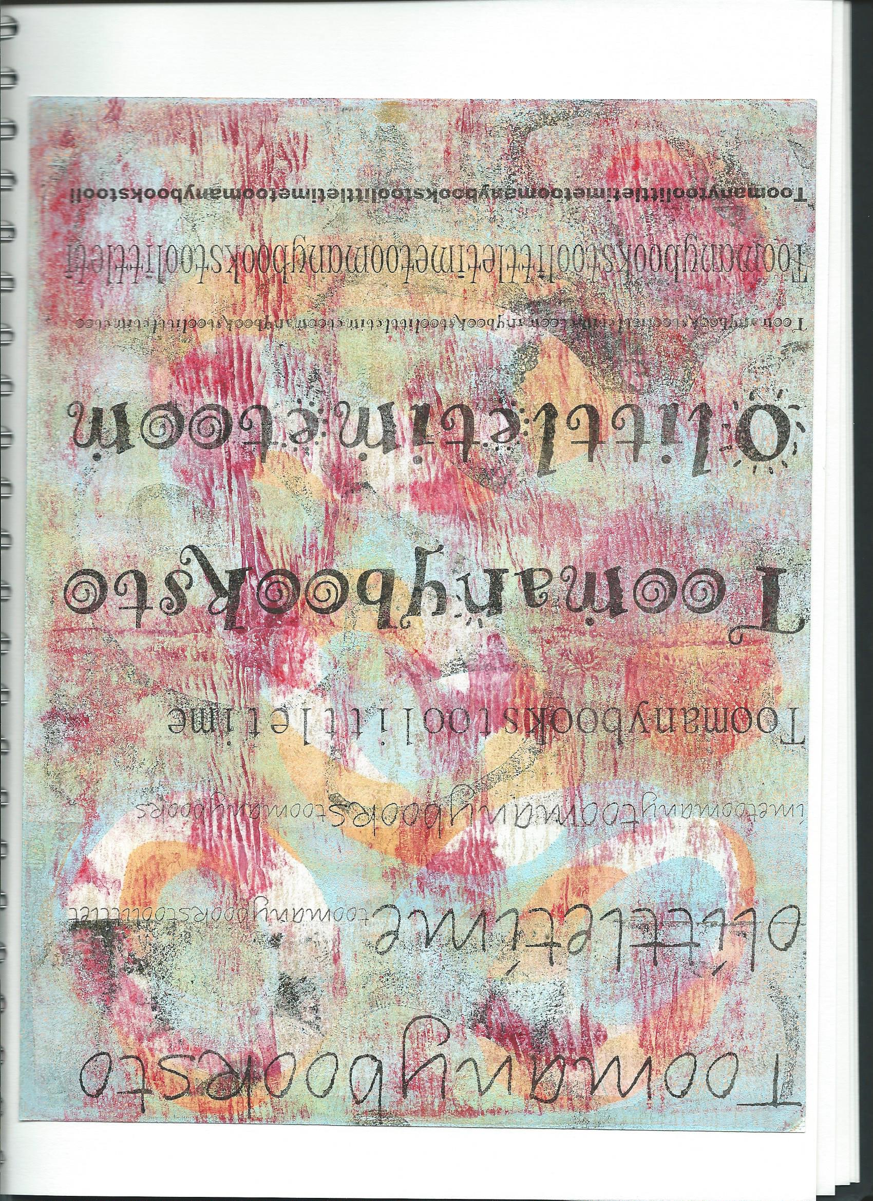
I have amassed over the years, a huge collection of my own painted and printed papers, which I group together in colour schemes and file in A3 folders.  I use these in my art, on canvas, on paper and in my textile work.  In fact using paper in my textiles pieces is my favourite medium.  I find that I can do everything and more on paper and I love to stitch on it.

So I turned to this resource to use for this activity.  I have also recently bought a Gelli-plate and have been mono printing using this.  As was mentioned on the Facebook site of Distant Stitch, this is addictive and now I have even more printed papers to add to the stash.

red book papers 003

red book papers 007

Pictured above is only a part of my stash of red papers.  I have used this resource to create my zigzag book celebrating the colour red.  All of the above papers were created by me and are either painted and/or printed and stamped and there is also a small number that are colour photocopies of collages that I had previously designed.

Red Book in Construction

This first section showing the covers and the eight pages are the front side of the zigzag book.  The reverse will be shown later on.
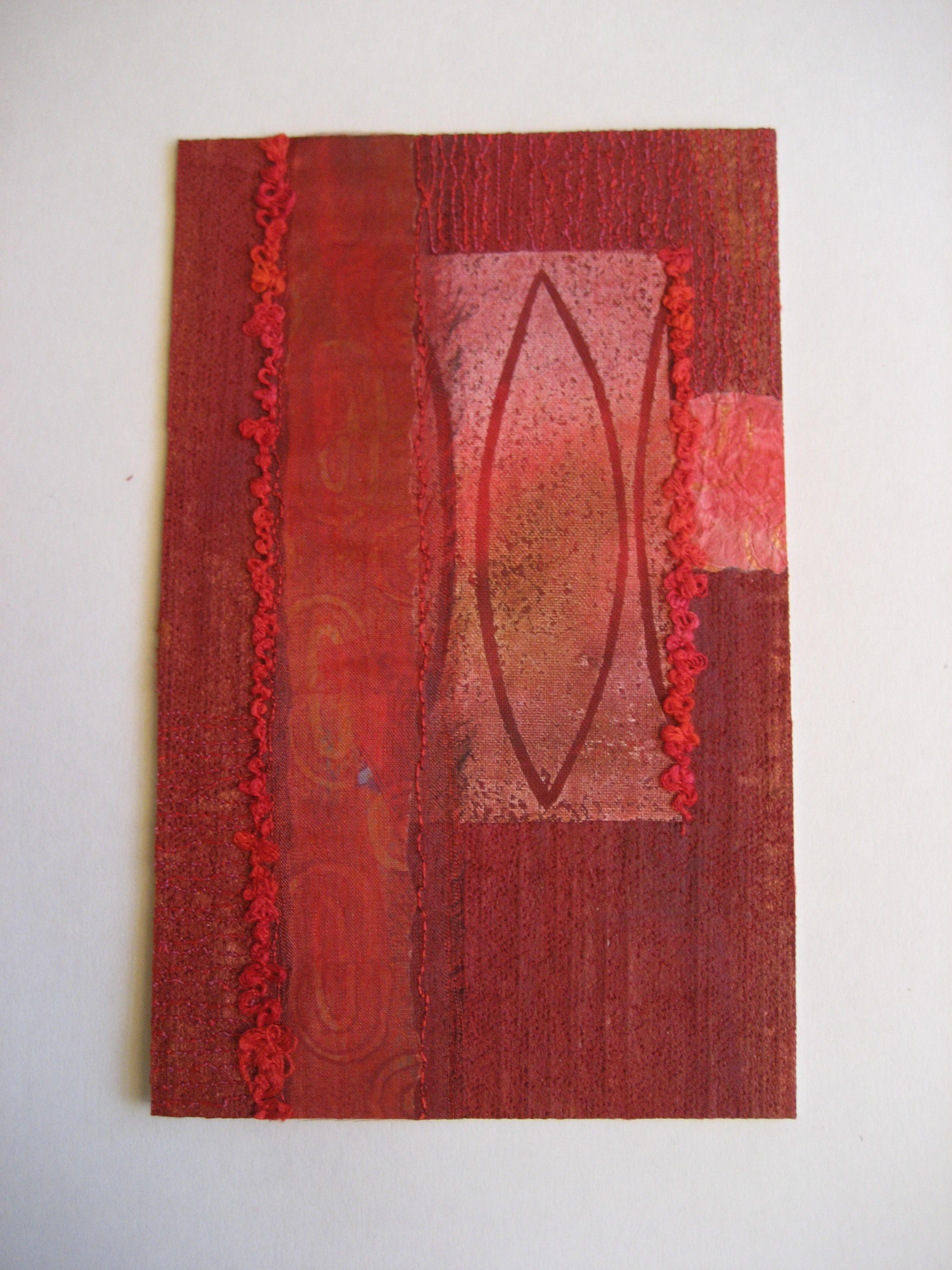
Front Cover

Red book in construction 001

Front cover of book.  Collage of hand painted and printed papers which has then been attached to mount board for strength.

Back Cover

Red book in construction 002

Back cover of book.  Collage of hand painted and printed papers attached to mount board for strength.

Page 1

Red book in construction 003

This is a fabric substrate with stamping (hand carved) and stitch, again painted with acrylics.

Page 2

Red book in construction 004

Page 2 of the book is a collage of painted and printed paper (cartridge).  Media is acrylics.

Page 3

Red book in construction 005

This page is again a collage consisting of various types of paper which are hand painted and/or printed.

Page 4

Red book in construction 006

This page is a small abstract painting onto canvas with added machine stitch.  Media used were gesso, acrylics and Derwent Inktense sticks.

Page 5

Red book in construction 007

This is a collage constructed from tracing paper which is a colour photocopy of an original printing onto cartridge paper.

Page 6

Red book in construction 008

This page is section of a painted abstract (cartridge paper substrate).

Page 7

Red book in construction 009

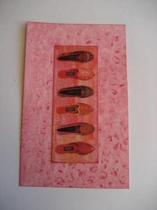
This page shows an image of shoes that I found in an old book.  It is mounted onto a printed piece of watercolour paper.

Page 8

Red book in construction 010

The last page in the book is a fabric and paper collage.  Painted bond-a-web was ironed to the background cloth and two pieces of printed paper were added along with a printed piece of textile.  Organza was attached over the vertical paper strip and machine stitch was added (thick thread in the bobbin and worked upside down.

Book in Construction (Reverse Side)

Red book in construction 011

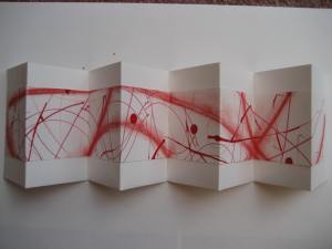
This photograph shows the reverse side of the zigzag book in construction.  I took a piece of A1 cartridge and used different media to compose an abstract.  I used soft pastel, acrylic ink with a dropper, markers, and fine liners.  From this large sheet I cut an interesting section to use as a strip which flows along the reverse side of the book.

Red book in construction 012

Close up of the finished strip of paper.

Red book in construction 013

Red book in construction 015

The above two images show the reverse side of the book attached to the zigzag construction.  I used a thick weight of cartridge paper which is in fact doubled, so it has a solid construction.  I attached the abstract strip to the foundation with double sided tape, as I did not want any warping.

Red book in construction 017

Red book in construction 018

The last two photographs show close up sections of the reverse side of the book.

Red Book Completed

Red book - completed 010Red book - completed 011

These two photographs show the book completed and closed (front and back views)  I inserted strips of organza ribbon between the book block and the two covers when they were being attached.

red book completed 3 002red book completed 2 009

These two photographs show the book open.  First the front side which has the individual pages and secondly the reverse side which shows the abstract banner and the front and back covers.

red book completed 3 004red book completed 2 004

A couple of close ups of the front side of the book, showing the individual pages.

red book completed 2 008red book completed 2 007

And finally two images showing close up views of the reverse side of the book which show the abstract banner and both the front and back covers.

This has been the favourite activity of this module as I love making books.

The whole module was hugely enjoyable  and I am looking forward to Module 2.


Chapter 8 – Extra Activity

Chapter 8 Activity 8.3 Still Life 3

This is a reproduction of painting number 2 which was changed in paint Shop Pro.  I am not very skilled in using this programme but played around with it for about an hour.  This is a negative representation of my painting.  I came upon this effect early on in my trials, but just loved it, and although I tried other effects and colours, I kept coming back to this one and finally decided to stick with it.

Chapter 8 - Extra Activity (2)

As I was so dissatisfied with both still lives, I decided to have another attempt.  I made the objects and the arrangement very simple.  As we have been looking at fruit and vegetables, I chose an orange, an apple and a lemon.  This painting is on watercolour paper, instead of cartridge paper, and it was painted using a mixture of watercolour and gouache.  This was a much better attempt.  I have managed to loosen up my brushstrokes and create a better painting because of it.  Simplification has helped, although the style is more Cezanne than Matisse!


Chapter 8 – Activity 8.3 – Paint a Still Life From Observation

Chapter 8 Activity 8.3 Still Life 2

This is the second attempt of a still life, this time from observation.  I changed the arrangement and the textiles used.  I prefer the colouring in this exercise, although I do not recall Matisse using black and white, lets just say that I am putting my own twist on it.  I love the patterning on these fabrics and the colours are still exaggerated.  Again, I have not loosened up at all, though.  I still think it is the size of the piece that restricts me, and tightens me up so much.  I do not like this painting either.  This is a learning curve, and I have reinforced my belief that I do not enjoy painting in such a realistic manner.  I did put in a lot of effort, but in my opinion, it is a failure.  Again, the vase was covered in a piece of mono-printed paper which has been collaged onto the painting at the end.  I have recently bought a gelli-plate and now have about 150 sheets of printed papers to play with!!

creative sketchbooks still life 2 014

This is a photo of the arrangement that I chose to paint this time.  I ended reducing the number of tulips in order to simplify the task.

Chapter 8 – Activity 8.2 – Paint a Still Life Picture in the Style of Matisse using a Photograph to Create the Composition

Chapter 8 Activity 8.2 Still Life 1

This was the first attempt of a still life in the style of Matisse.  I took a photograph of the arrangement and as instructed I traced over the photo and then the tracing was painted using acrylics.  I found this exercise very difficult.  I love painting, but never use this subject matter – in fact I am an abstract painter (I will include a photo of my normal style at the end of this chapter).

The size of the painting was an issue – too small for me.  I did feel that I was ‘painting by numbers’ and I am so trying to get away from neat and tidy work, that this made me want to scream!  It is a good representation of the photograph, but so tight!  This was not the way Matisse painted at all.  The composition of the piece is pleasing enough and I have used patterned fabrics and the heightened colours that Matisse preferred.

creative sketchbook still life 026

This is the original photograph that I used for this exercise.  I do not own any patterned vases – all mine are either white or glass, so I wrapped the vase in a piece of mono-printed paper.  I have collaged a piece of this paper onto the finished painting, as I would not have been able to replicate it satisfactorily – slight cheat – but I did initially create it!